Let me get you in on a dirty little secret. It's something I've learned after years of working in publishing and web design.
People don't read.
You might find this an ironic observation, given that I work for an academic publisher, but I tell you it's true, and it's especially true of academics — people don't read.
I have my theories. They may all be wrong, I don't know. But I have them anyway. One is, people don't read because it's too easy. Most literate people can't help but read something; you see it, it registers as a word instantly, and — this is the critical part — then you decide whether or not to pay attention. In our information-rich, give me your attention please society, we're surrounded by words . . . and we ignore most of them.
Don't believe me? Stop and take a look around for a moment. Words, words, words. If your desk looks like mine, I'm willing to bet that, without turning your head, and without counting these words here, you can see around 500–1000 words. You're ignoring all of them (including the ten sticky notes that you wrote and put in prominent places in order to remember things.)
That's just you and me. Enter the academic, stage left, with his nose in a book. He is, obviously, reading. Or is he? My answer is, probably not. Remember the last term paper you wrote? Did you read every source, cover to cover? Of course not. You skimmed it until you found what you were looking for. You noted it, cited it, wrote your paper, you kept moving. The only difference is that the academic has gotten good enough at this to do it for a living. Their term papers get published.
And so we come to the relevant question: how do you alert someone like this to something they aren't expecting?
Case in point: each year, my employer attends and displays at a major conference. We're one of the bigger players in our market (big fish, little pond) and we generally try to get about six booth spaces to display our wares. In order to keep such a space all within easy reach, we typically reserve two sides of an aisle — books to the left, books to the right, and three booths' worth of books across the aisle.
Now, this creates two problems. One is the person who finds the booth staff first, and asks, "Where are the books?" It's easy enough to point out the stacks to them. The second is the person who finds the books first, but doesn't know to look to the other side of the aisle to find the checkout desk. This is harder.
The easy answer is, of course, to put up a sign saying that the checkout is on the other side. But people aren't looking for such signs — they're looking for a cash register (does anyone use these anymore at conferences?) or a person (there are plenty of those around) or . . . what?
Our solution? Make a sign they can't help but read.

Specifically, we made them in Sumerian, Neo-Assyrian (both use cuneiform), Egyptian, and bet-you've-never-heard-of-it Hieroglyphic Luwian. Can you read it? I can't — but we have customers who can. Customers who are quite proud of that ability, actually, and who happily contributed their expertise into making the top halves of each sign.

Why does it work? Well, for the customers that can read it, there's the unexpected, proud rush of being able to use their skills in an everyday setting. For the ones that can't read it, there's what Chip and Dan Heath call a "knowledge gap" that invites them to learn more — and gets them down to the English translation near the bottom.

The added bonus is that it's also marketing: We get it. Our target market is ancient Near Eastern studies; we want people who can read this stuff. There's nothing like showing them that we literally speak their language. Outsiders, at the very least, get a memorable introduction to what we do.

My part in all of this was quite fun. I got to take the handwritten samples (or in the case of the cuneiform, PDF) and either typeset or convert each one into a format I could use.

My biggest barrier was learning to typeset Egyptian, but once I got into it, it was surprisingly easy to do. Having the transliteration below helped a lot.
Next, I wrangled the various pieces out of Photoshop, InDesign, and JSEsh, and got them into Illustrator, where I cleaned up the paths and got them ready to send out to Ponoko. (I don't get paid to promote Ponoko. I promote them anyway. Although if they're reading this. . . .) Most of the programs used for creating these languages aren't at the same level of development as other software (wonder why?) so there was a lot of cleanup involved.
A few weeks later, I got my expected package, and I got an excuse to get crafty.

It's silly, but I love this tag on the boxes. I really do feel this way when I get a package with something I've designed!.
I was a bit concerned about how I was going to get white engraving to show up on white plastic, until someone pointed out that the protective paper they apply to the acrylic forms a perfect, precision mask.

A little masking tape and a spraycan later, and that problem was solved.


All that was left was to wear my fingernails down to stubs peeling off the protective paper and revealing the final product.

Why stop at the "obvious" solution to a problem when you can have this much fun with it?
Several people have now asked who supplied the various texts for this project. Gary Greig (University of Chicago) supplied the Egyptian; Annick Payne (Freie Universität Berlin) contributed the Hieroglyphic Luwian; Simo Parpola (University of Helsinki) sent in the Sumerian; and repeat co-conspirator Bob Whiting (also of the University of Helsinki) gave us the Neo-Assyrian text.
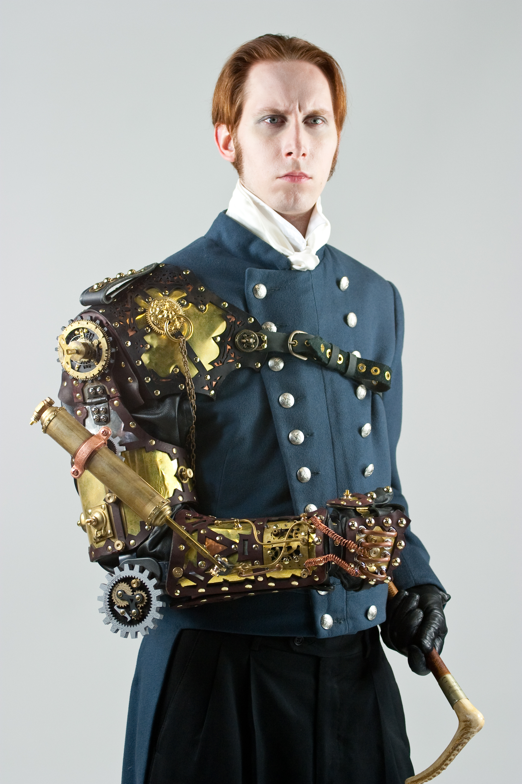 You may or may not be aware of steampunk, a genre of sci-fi/fantasy (or, more properly now, speculative fiction) commonly set in the steam-powered Victorian England, which has taken on its own unique sense of style — lots of brass, gears, filigree, corsets, and heavy doses of "what if?" I confess my fascination with the visual theme, even if the fiction itself doesn't seem all that magnificent.


