I have been reminded, once again, that there is a fine line between cleverness and obscurity. I tend to wander across that line on a regular basis.
Many of the books I get to design covers for can be classified as "esoteric." If I knew the book were about, say, pottery, I could put a nice pot on the cover. But I don't always know exactly what the book is about, even. Often, I get a photocopied Foreword, which I read, scanning for a hook I can hang a picture on.
This book had a very interesting Foreword, talking about (of all things) what was considered "esoteric" in the ancient world; that is, which prophecies, myths and legends were known to scholars, which were known to common men, and how the two sets differ, especially when they keep recurring throughout history. There was an interesting mention of cuneiform tablets found with parallel colums of stories. The images were suggesting themselves to me left and right. Or up and down. Repeatedly.
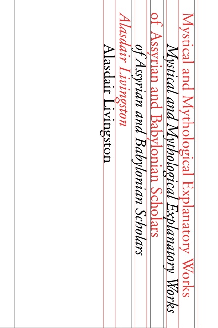
A wonderful, bold design! Filled with meaning, and displayed with a great economy of elements — just lines and text in two colors. Sideways English even sort of looks like cuneiform. So what if it wasn't legible...? I sent a copy around for comments with a note:
- Do you like it?
- Do you think the thoughtful reader will draw the connection between the way the type is arranged, and the different versions and columnar lists Livingstone describes?
Needless to say, I'm back at the drawing board for this one...

1 comment:
You might consider something more straightforward, like, I don't know, a picture of a cuneiform tablet, with the title overtop in white. Or find a font that makes the letters look a little bit like cuneiform (by forming them out of wedge shapes and dots or something, but still clearly legible Latin characters) and use a bump map or something to make it look like the title itself has been tapped out in clay.
Granted, you've probably already used both of those ideas for other covers by now. Nonetheless, either would be more clear *and* more visually attractive.
At *least* use colors other than red and black on white, for crying out loud. Nobody sees red and black on white and thinks, "Ah, clay tablets and the ancient near east!"
Post a Comment